Welcome back, gracenotesnyc!
Thank you so much for patiently waiting for gracenotesnyc to update and upgrade our blog (I say “our” as if I have employees…nope, just the best volunteers out there!). There are a ton of great upgrades to the site – some are obvious, others are not (especially to those of you that subscribe to the blog through RSS feed and don’t have an opportunity to come to the site). Here’s what we’ve been working on for the past two weeks:
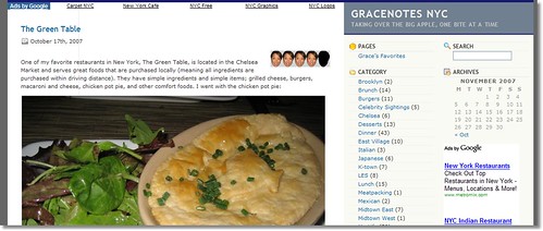
General layout of gracenotesnyc:
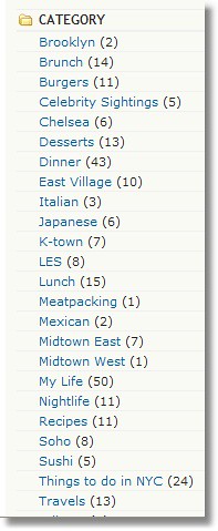
The layout is a little more spiffy now; I started out with a basic background but it was time to upgrade. People mentioned that they wanted to see categories, which were a little difficult to find before, so my “tech team” fixed that problem and made a whole side bar of categories based on location and food:
So if you’re ever looking for a place to go for brunch, just click on it and it’ll lead you to all of my posts on brunch foods.
Another feature that allows you to search: archives. If you’re interested in reading entries from a specific month, just click on the calendar:
Finally, the upgrade that I’m MOST excited about: RATINGS. I’ve named them “Grace Faces,” since, you know, the ratings are based off my face and my name is … Grace:
Ratings go from 1 Grace Face (meaning the restaurant sucked) all the way to 5 Grace Face’s (meaning you should book a reservation ASAP). If the place is REALLY bad, there’s a SPECIAL face:
That means you should RUN in the opposite direction of the restaurant!!
I’ll post another entry about Grace Faces soon and I’m working on adding Grace Faces to older entries. Hope it was worth the wait!

Reader Comments
looks good! I’ll definitely be looking forward to your fro-yo entry 🙂